
On a steamy June day in 1777, the Continental Congress took a brief break from the monumental task of running a revolution to deal with something that seems surprisingly simple in retrospect: what should the American flag look like? The resolution they passed on June 14th was refreshingly concise, stating that “the flag of the United States be thirteen stripes, alternate red and white; that the union be thirteen stars, white in a blue field, representing a new constellation.”
That poetic phrase about a “new constellation” turned out to be both inspiring and maddeningly vague. Congress didn’t specify how the stars should be arranged, how many points they should have, or even whether the flag should start with a red or white stripe at the top. This ambiguity led to one of the interesting aspects of early American flag history—for decades, no two flags looked exactly alike.
The 1777 resolution came out of Congress’s Marine Committee business, and at least some historians caution that it may have been understood initially as a naval ensign, not a fully standardized “national flag for all uses.”
A Constellation of Designs
The lack of official guidance meant that flag makers exercised considerable artistic freedom. Smithsonian researcher Grace Rogers Cooper found at least 17 different examples of 13-star flags dating from 1779 to around 1796, and flag expert Jeff Bridgman has documented 32 different star arrangements from the era. Some makers arranged the stars in neat rows, others formed them into a single large star, and still others created elaborate patterns that spelled out “U.S.” or formed other symbolic shapes. An official star pattern would not be specified until 1912 and versions of the 13-star flag remained in ceremonial use until the mid-1800s.
The most famous arrangement, of course, is the Betsy Ross design with its circle of 13 stars. What many people don’t realize is that experts date the earliest known example of this circular pattern to 1792—in a painting by John Trumbull, not on an actual flag from 1776.
Did the Continental Army Actually Use This Flag?
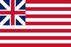
Here’s where things get interesting and a bit murky. The short answer is: not much, and not right away. The Continental Army had been fighting for over two years before Congress even adopted the Stars and Stripes, and by that point, individual regiments had already developed their own distinctive colors and banners. These regimental flags served practical military purposes—they helped units identify each other in the chaos of battle and gave soldiers something to rally around. Additionally, the Continental Army frequently used the Grand Union Flag (13 stripes with a British Union in the canton), which predates the 13-star design.
What’s more revealing is a series of letters from 1779—two full years after the Flag Resolution—between George Washington and Richard Peters, Secretary of the Board of War. In these letters, Peters is essentially asking Washington what flag he wants the army to use. This correspondence raises an obvious question: if Congress had settled the flag issue in 1777, why was Washington still trying to figure it out in 1779? The evidence suggests that variations of the 13-star flag were primarily used by the Navy in those early years, while the Army continued to use various regimental standards.
Navy Captain John Manley expressed this confusion perfectly when he wrote in 1779 that the United States “had no national colors” and that each ship simply flew whatever flag the captain preferred. Even as late as 1779, the War Board hadn’t settled on a standard design for the Army. When they finally wrote to Washington for his input, they proposed a flag that included a serpent and numbers representing different states—a design that never caught on.
National “stars and stripes” banners did exist during the late war years and appear in some period art and descriptions, but clear, securely dated 13‑star Army battle flags are rare and often disputed.13‑star flags are better documented in early federal service such as maritime and lighthouse use in the 1790s than they are in Continental Army field service before 1783.
The Betsy Ross Question
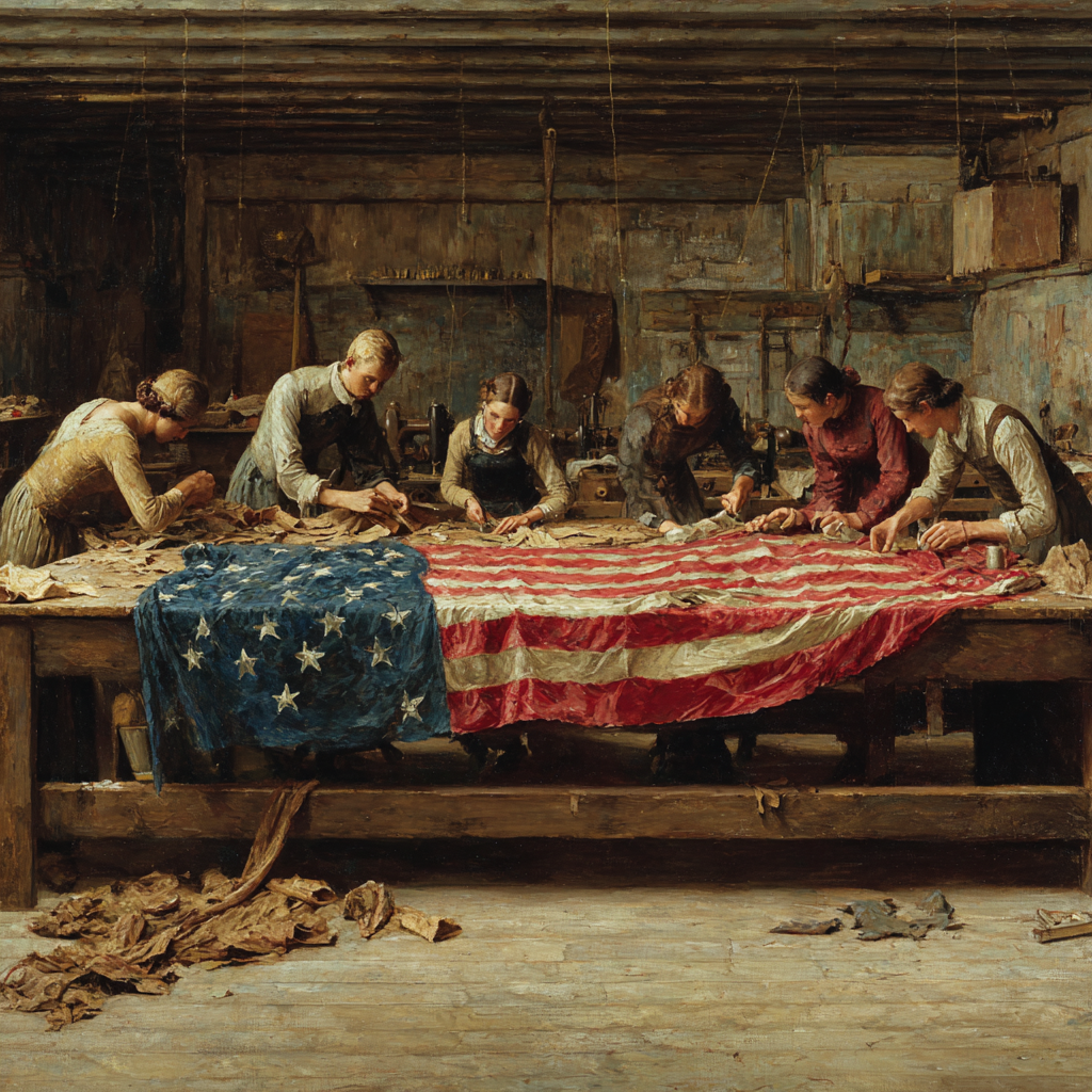
Now we come to one of America’s most enduring flag legend. The story is familiar to most Americans: in 1776, George Washington, Robert Morris, and George Ross visited Philadelphia upholsterer Betsy Ross and asked her to sew the first American flag. She suggested changing the six-pointed stars to five-pointed ones, demonstrated her one-snip technique for making a perfect five-pointed star, and she then produced the first Stars and Stripes.
It’s a great story. There’s just one problem: historians have found virtually no documentary evidence to support it. The tale didn’t surface publicly until 1870—nearly a century after the supposed event—when Betsy Ross’s grandson, William Canby, presented it in a speech to the Historical Society of Pennsylvania. Canby relied entirely on family oral history, including affidavits from Ross’s daughter, granddaughter, and other relatives who claimed they had heard Betsy tell the story herself. But Canby himself admitted that his search through official records revealed nothing to corroborate the account.
Historians don’t dispute that Betsy Ross was a real person who did real work. Documentary evidence shows that on May 29, 1777, the Pennsylvania State Navy Board paid her a substantial sum for “making ships colours.” She ran a successful upholstery business and continued making flags for the government for more than 50 years. But as historian Marla Miller puts it, “The flag, like the Revolution it represents, was the work of many hands.” Modern scholars generally view the question not as whether Ross designed the flag—she almost certainly didn’t—but whether she may have been among the many people who produced early flags.
Who Really Designed It?
If not Betsy Ross, then who? The strongest candidate is Francis Hopkinson, the New Jersey delegate to the Continental Congress who also helped design the Great Seal of the United States and early American currency. In 1780, Hopkinson sent Congress a bill requesting payment for his design work, specifically mentioning “the flag of the United States of America.” He likely designed a flag with the stars arranged in rows rather than circles, and his bills for payment submitted to Congress mentioned six-pointed stars rather than the five-pointed ones that became standard.
Unfortunately for Hopkinson, Congress refused to pay him, arguing that he wasn’t the only person on the Navy Committee and therefore shouldn’t receive singular credit or compensation.
The irony is rich: Hopkinson was asking for a quarter cask of wine or £2,700 for designing what would become one of the world’s most recognizable symbols. Congress essentially told him, “Thanks, but we’re not paying.” There’s a lesson about government contracts in there somewhere.
What Survived
Of the hundreds of flags made and carried during the Revolutionary War, only about 30 are known to survive today. These rare artifacts offer fascinating glimpses into how Americans visualized their new nation. The Museum of the American Revolution brought together 17 of these original flags in a 2025 exhibition—the largest gathering of such flags since 1783.
The most significant surviving 13-star flag is probably Washington’s Headquarters Standard, a small blue silk flag measuring about two feet by three feet. It features 13 white, six-pointed stars on a blue field and descended through George Washington’s family with the tradition that it marked the General’s presence on the battlefield throughout the war. Experts consider it the earliest surviving 13-star American flag. Due to light damage, it can only be displayed on special occasions.

Other surviving flags tell different stories. The Brandywine Flag, used at the September 1777 battle of the same name, is one of the earliest stars and stripes—the flag is red, with a red and white American flag image in the canton.

The Dansey Flag, captured from the Delaware militia by a British soldier, was taken to England as a war trophy and remained in his family until 1927. The flag features a green field with 13 alternating red and white stripes in the upper left corner signifying the 13 colonies.

These and other flags weren’t just military equipment—they were powerful symbols that people fought under and, sometimes, died defending.
The Bigger Picture
What makes the story of the 13-star flag so compelling isn’t really about who sewed it or exactly when it first flew. It’s about what the flag represented in an era when the very concept of the United States was still being invented. The June 1777 resolution called for stars forming “a new constellation”—a beautiful metaphor for a new nation finding its place among the powers of the world.
The fact that no two early flags looked exactly alike might seem like a problem from our standardized modern perspective, but it tells us something important about the Revolution itself. Just as the colonies were learning to act as united states while maintaining their individual identities, flag makers across the new nation were interpreting a simple congressional resolution in their own ways, creating variations on a shared theme.
As historian Laurel Thatcher Ulrich points out, there was no “first flag” worth arguing over. The American flag evolved organically, shaped by the practical needs of the Navy, the Army, militias, and civilian flag makers who each contributed to its development. Whether Betsy Ross made one of those early flags or not, her story endures because it captures something Americans want to believe about our origins: that ordinary citizens, working in small shops and homes, helped create the symbols of the new republic.
Sources:
History.com: https://www.history.com/this-day-in-history/june-14/congress-adopts-the-stars-and-stripes
Flags of the World: https://www.crwflags.com/fotw/flags/us-1777.html
Wikipedia Flag of the United States: https://en.wikipedia.org/wiki/Flag_of_the_United_States
Museum of the American Revolution: https://www.amrevmuseum.org/
American Battlefield Trust: https://www.battlefields.org/learn/articles/short-history-united-states-flag
US History (Betsy Ross): https://www.ushistory.org/betsy/
Library of Congress “Today in History”: https://www.loc.gov/item/today-in-history/june-14/
Flag images from Wikimedia Commons


The Price Tag Mystery: Why Nobody Really Knows What Healthcare Costs in America
By John Turley
On January 29, 2026
In Commentary, Medicine, Politics
Imagine walking into a store where nothing has a price tag. When you get to the register, the cashier scans your items and tells you the total—but that total is different for every customer. Your neighbor might pay $50 for the same items that cost you $200. The store won’t tell you why, and you won’t find out until after you’ve already “bought” everything.
Welcome to American healthcare, where the simple question “how much does this cost?” has no simple answer.
You might think I’m exaggerating, but the evidence suggests otherwise. Research published in late 2023 by PatientRightsAdvocate.org found that prices for the same medical procedure can vary by more than 10 times within a single hospital depending on which insurance plan you have, and by as much as 33 times across different hospitals. A knee replacement that costs around $23,170 in Baltimore might run $58,193 in New York. An emergency department visit that one facility charges $486 for might cost $3,549 at another hospital for the identical service.
The fundamental problem is that hospitals and doctors don’t have one price for their services. They have dozens, sometimes hundreds, of different prices for the exact same procedure depending on who’s paying. This bizarre system evolved because most healthcare in America isn’t a simple transaction between patient and provider—there’s a third party in the middle called an insurance company, and that changes everything.
The Fiction of Chargemaster Prices
A hospital chargemaster is essentially the hospital’s internal price list—a massive catalog that assigns a dollar amount to every service, supply, test, medication, and procedure the hospital can bill for, from an aspirin to a complex surgery. These listed prices are usually very high and are not what most patients actually pay; instead, the chargemaster functions as a starting point for negotiations with insurers and government programs like Medicare and Medicaid, which typically pay much lower, pre-set rates. What an individual patient ultimately pays depends on several factors layered on top of the chargemaster price. Think of them like the manufacturer’s suggested retail price on a car: technically real, but nobody pays them.
A hospital might list an MRI at $3,000 or a blood test at $500. But then insurance companies come in. They represent thousands or millions of potential patients, which gives them serious bargaining power. They negotiate with hospitals along these lines: “We’ll send you lots of patients, but only if you give us a discount.” So, the hospital agrees to accept much less—maybe they’ll take $1,200 for that $3,000 MRI or $150 for the blood test. This discounted amount is called the “negotiated rate,” and it’s what the insurance company will really pay.
Here’s where it gets messy: every insurance company negotiates its own rates with every hospital. Blue Cross might negotiate one price, Aetna a different price, UnitedHealthcare yet another. The same exact MRI at the same hospital might be $1,200 for one insurer’s customers and $1,800 for another’s. And these negotiated rates have traditionally been kept secret—treated like confidential business information that gives each party a competitive advantage.
The Write-Off Game
What happens to that difference between the chargemaster price and the negotiated rate? The hospital “writes it off.” That’s accounting language for “we accept that we’re not getting paid this money, and we’re taking it off the books.” If the hospital charged $3,000 but agreed to accept $1,200, they write off $1,800. This isn’t lost money in the normal sense—they never expected to collect it in the first place. The chargemaster prices are inflated specifically because everyone knows discounts are coming. Some hospitals now post “discounted cash prices” that are often far below chargemaster and sometimes even below some negotiated rates. These are sometimes, though not always, offered to uninsured patients, generally referred to as self-pay. There can be a catch—some hospitals require lump-sum payment of the total bill to qualify for the lower price.
According to the American Hospital Association, U.S. hospitals collectively plan to write off approximately $760 billion in billed charges in 2025 across all categories of write-offs. That’s not a typo—$760 billion. These write-offs happen in several different situations. The most common are contractual write-offs, where the provider has agreed to accept less than their list price from insurance companies.
Hospitals have far more write-offs than just contractual. They also write off money for charity care—treating patients who can’t afford to pay anything, and they write off bad debt when patients could pay but don’t. They write off small balances that aren’t worth the administrative cost of collection, and they write off amounts related to various billing errors, denied claims, and coverage disputes. Healthcare providers typically adjust about 10 to 12 percent of their gross revenue due to these various write-offs and claim adjustments.
Why Such Wild Variation?
Even with all these negotiated discounts built into the system, the prices still vary enormously. A 2024 study from the Baker Institute found that for emergency department visits, the price charged by hospitals in the top 10% can be three to seven times higher than the hospitals in the bottom 10% for the identical procedure. Research published in Health Affairs Scholar in early 2025 found that even after adjusting for differences between insurers and procedures, the top 25% of prices across all states is 48 percent higher than the bottom 25% of prices for inpatient services.
Several factors drive this variation. Hospitals in areas with less competition can charge more because insurers have fewer alternatives for negotiation. Prestigious hospitals can demand higher rates because insurers want them in their networks to attract customers. Some insurance companies have more bargaining power than others based on their market share. There’s no central authority setting prices—it’s all private negotiations, hospital by hospital, insurer by insurer, procedure by procedure.
For patients, this creates a nightmare scenario. Even if you have insurance, you usually have no idea what you’ll pay until after you’ve received care. Your out-of-pocket costs depend on your deductible (the amount you pay before insurance kicks in), your copay or coinsurance (your share after insurance starts paying), and whether the negotiated rate between your specific insurance and that specific hospital is high or low. Two people with different insurance plans getting the same procedure at the same hospital on the same day can end up with drastically different bills.
Research using new transparency data confirms this isn’t just anecdotal. A study from early 2025 found that for something as routine as a common office visit, mean prices ranged from $82 with Aetna to $115 with UnitedHealth. Within individual insurance companies, the price of the top 25% of office visits was 20 to 50 percent higher than the bottom 25%, meaning even within one insurer’s network, where you go or where you live makes a huge difference.
The Government Steps In
The federal government finally said “enough” and started requiring transparency. Since 2021, hospitals must post their prices online, including what they’ve negotiated with each insurance company. The Centers for Medicare and Medicaid Services (CMS) strengthened these requirements in 2024, mandating standardized formats and increasing enforcement. Health insurance plans face similar requirements to disclose their negotiated rates.
The theory was straightforward: if patients could see prices ahead of time, they could shop around, which would force prices down through competition. CMS estimated this could save as much as $80 billion by 2025. The idea seemed sound—transparency works in other markets, so why not healthcare?
In practice, it’s been messy. A Government Accountability Office (GAO) report from October 2024 found that while hospitals are posting data, stakeholders like health plans and employers have raised serious concerns about data quality. They’ve encountered inconsistent file formats, extremely complex pricing structures, and data that appears to be incomplete or possibly inaccurate. Even when hospitals post the required information, it’s often so convoluted that comparing prices across facilities becomes nearly impossible for average consumers.
An Office of Inspector General report from November 2024 found that not all selected hospitals were complying with the transparency requirements in the first place. And CMS still doesn’t have robust mechanisms to verify whether the data being posted is accurate and complete. The GAO recommended that CMS assess whether hospital pricing data are sufficiently complete and accurate to be usable, and to assess if additional enforcement if needed.
Imagine trying to comparison shop when one store lists prices in dollars, another in euros, and a third uses a proprietary currency they invented. That’s roughly where we are with healthcare price data—technically available, but practically unusable for most people trying to make informed decisions.
The Trump administration in 2025 signed a new executive order aimed at strengthening enforcement of price transparency rules and directing agencies to standardize and make hospital and insurer pricing information more accessible; this action built on rather than reduced the earlier requirements. Hopefully this will improve the ability of patients to access real costs, but it is my opinion that the industry will continue to resist full and open compliance.
The Limits of Shopping for Healthcare
There’s also a deeper philosophical problem: for healthcare to work like a normal market where price transparency drives competition, patients would need to be able to shop around based on price. That could work for scheduled procedures like knee replacements, colonoscopies, or elective surgeries. You have time to research, compare, and choose.
But it doesn’t work at all when you’re having a heart attack, or your child breaks their arm. You go to the nearest hospital, period. You’re not calling around asking about prices while someone’s having a medical emergency. Even for non-emergencies, choosing based on price assumes equal quality across providers, which isn’t always true and is even harder to assess than price itself.
A study on price transparency tools found mixed results on whether they truly reduce spending. Some research shows modest savings when people use price comparison tools for shoppable services like imaging and lab work. But utilization of these tools remains low, and for many healthcare encounters, price shopping simply isn’t practical or appropriate.
Who Really Knows?
So, who truly understands what things cost in this system? Hospital administrators know what different insurers pay them for specific procedures, but that knowledge is limited to their facility. They don’t necessarily know what other hospitals charge. Insurance company executives know what they’ve negotiated with various hospitals in their network, but they haven’t historically shared meaningful price information with their customers in advance. And they don’t know what their competitors have negotiated.
Patients, caught in the middle, often find out their costs only when they receive a bill weeks after treatment. By that point, the care has been delivered, and the financial damage is done. Recent surveys suggest that surprise medical bills remain a significant problem, with many patients receiving unexpected charges from out-of-network providers they didn’t choose or even know were involved in their care.
The people who are starting to get a comprehensive view are researchers and policymakers analyzing the newly available transparency data. Studies published in 2024 and 2025 using these data have given us unprecedented visibility into pricing patterns and variation. But this is aggregate, statistical knowledge—it helps us understand the system but doesn’t necessarily help individual patients figure out what they’ll pay for a specific procedure.
Where We Stand
The transparency regulations represent a genuine attempt to inject some market discipline into healthcare pricing. Making negotiated rates public breaks down the information asymmetry that has allowed prices to vary so wildly. In theory, if patients and employers can see that Hospital A charges twice what Hospital B does for the same procedure, competitive pressure should push prices toward the lower end.
There’s some early evidence this might be working. A study of children’s hospitals found that price variation for common imaging procedures decreased by about 19 percent between 2023 and 2024, though overall prices continued rising. Whether this trend will continue and expand to other types of facilities remains to be seen. I am concerned that rather than lowering overall prices it may cause hospitals at the lower end to raise their prices closer to those at the higher end.
Significant obstacles remain. The data quality issues need resolution before the information becomes truly usable. Many patients lack either the time, expertise, or practical ability to shop based on price. And the fundamental structure of American healthcare—with its complex interplay of providers, insurers, pharmacy benefit managers, and government programs—means that even perfect price transparency won’t create a simple, straightforward market.
So, to return to the original question: does anyone truly know the cost of medical care in the United States? In an aggregate sense, researchers and policymakers are starting to understand the patterns thanks to transparency requirements. The data are revealing just how variable and opaque pricing has been. But as a practical matter for individual patients trying to figure out what they’ll pay for needed care, not really. The information is becoming available but remains largely inaccessible or incomprehensible for ordinary people trying to make informed healthcare decisions.
The $760 billion in annual write-offs tells you everything you need to know: the posted prices are largely fictional, the negotiated prices vary wildly, and the system has evolved to be so complex that even the people operating within it struggle to understand the full picture. We’re making progress toward transparency, but we’re a long way from a healthcare system where patients can confidently get the answer to the simple question: “How much will this cost?”
A closing thought: All of this could be solved by development of a single-payer healthcare system such as I proposed in my previous post America’s Healthcare Paradox: Why We Pay Double and Get Less.