
If you’ve ever winced taking your first steps out of bed in the morning, you may have already made an involuntary acquaintance with heel spurs — or more precisely, with the condition that often travels with them. The term itself sounds alarming, and for a brief but colorful stretch of American political history, it became something far more charged than a footnote to podiatry. But before we get to the politics, it’s worth understanding what a heel spur actually is, because the medical reality is both more mundane and more complicated than the caricature.
What Exactly Is a Heel Spur?
A heel spur is a small bony outgrowth — technically called a calcaneal spur — that extends from the underside of the heel bone (the calcaneus). It forms at the spot where the plantar fascia — the thick ligament running the length of your foot from heel to toe — attaches to the heel bone. The spur is not, despite what the name implies, a sharp spike. It is typically smooth and rounded, though it can still cause irritation if it presses into surrounding soft tissue.

Heel spurs affect about 10% of the population, making them one of the more common foot conditions around, though most people who have one don’t know it. The spur develops gradually — usually over months or even years — as the body deposits calcium in response to chronic stress at that heel attachment point. Think of it less as damage and more as your skeleton’s attempt at reinforcement.
What Causes Them?
The underlying driver is repetitive mechanical stress on the foot. Heel spurs are particularly associated with strains on foot muscles and ligaments, stretching of the plantar fascia, and repeated small tears in the membrane covering the heel bone. Athletes who do a lot of running and jumping are especially prone.
But you don’t need to be an elite runner to develop one. Walking gait problems — particularly overpronation, where the foot rolls inward — place uneven stress on the heel with each step. Worn-out or poorly fitted shoes, which fail to absorb shock or support the arch, compound the problem. Obesity increases the mechanical load on the heel. Occupations that require prolonged standing or walking on hard surfaces put the plantar fascia under constant tension. And as people age, tendons and ligaments lose their elasticity, making the tissues more vulnerable to micro-tears and the subsequent bony repair response.
Heel spurs are also closely connected to a condition most people have heard of: plantar fasciitis. The two are related a but not identical. Plantar fasciitis is inflammation of the plantar fascia itself, usually from overuse. A heel spur can develop as a downstream consequence of that inflammation — the body lays down extra bone in response to the ongoing stress at the fascia’s attachment point.
Symptoms — or the Lack Thereof
Here’s the part that surprises most people: the majority of heel spurs cause no symptoms at all, and many are discovered incidentally on X-rays taken for other reasons. Only about 5% of heel spurs are estimated to be symptomatic.
When a heel spur does produce symptoms, the experience is heavily intertwined with plantar fasciitis. The classic description is a sharp, stabbing pain on the bottom of the foot first thing in the morning, or after any prolonged rest. Many people compare it to stepping on a tack. Paradoxically, this pain often eases somewhat after walking around for a few minutes, only to return after extended time on the feet or after another rest. It’s that “worse in the morning” quality that tends to be the giveaway.
Other symptoms, when present, can include localized swelling, warmth, and tenderness along the front of the heel, as well as increased sensitivity on the underside of the foot. It’s worth noting that the pain associated with a heel spur is not generally thought to come from the bony spur itself, but from the irritation it causes in the surrounding soft tissue — tendons, ligaments, and bursae.
How Is It Diagnosed?
Diagnosis typically begins with a physical exam. Your doctor or podiatrist will ask about when the pain started, what activities preceded it, and what makes it better or worse. They’ll examine your foot for tenderness at specific points, assess your range of motion, and check foot alignment and press on key areas to locate the source of pain.
Imaging confirms the picture. An X-ray can clearly show the bony spur and is the most commonly used test. That said, the size of the spur on an X-ray doesn’t necessarily correspond to how much pain a patient is experiencing — a small spur can be quite painful while a large one may cause no trouble at all. In more complex cases, an MRI may be ordered to assess the soft tissues more closely and evaluate whether plantar fasciitis or another condition is also in play.
Treatment Options
The reassuring news is that the vast majority of cases resolve without surgery. More than 90% of patients improve with nonsurgical treatment. The catch is that conservative management requires patience — improvement typically takes weeks, and more stubborn cases can take months.
The cornerstone of treatment is rest and reducing the activities that provoke pain. This doesn’t necessarily mean completely stopping exercise; low-impact alternatives like swimming, cycling, or rowing allow you to stay active while giving the heel a break from impact. Icing the bottom of the foot after activity helps manage inflammation. Over-the-counter anti-inflammatory medications like ibuprofen or naproxen can provide relief, though they’re intended for short-term use.
Footwear matters enormously. Supportive shoes with good arch support, cushioning, and a slight heel rise reduce the strain on the plantar fascia. Custom orthotics with molded insoles designed to redistribute pressure across the foot are often recommended, particularly for people with gait abnormalities or flat feet. Physical therapy can be part of the treatment plan, focusing on stretching the calf muscles and plantar fascia, strengthening the foot’s intrinsic muscles, and correcting biomechanical issues.
For cases that don’t respond to these initial measures, the next tier of treatment includes corticosteroid injections to reduce inflammation at the spur site, and extracorporeal shockwave therapy — a non-invasive procedure that uses sound waves to stimulate healing in chronically inflamed tissue. Surgery is reserved for the minority of cases where conservative treatment fails after nine to twelve months. Possible complications include nerve pain, infection, scarring, and — with plantar fascia release — the risk of foot instability or stress fracture. Most orthopedic surgeons regard surgery as a last resort.
Are Heel Spurs Debilitating?
For most people, the honest answer is: no. Heel spurs are a common condition with a favorable prognosis, especially with early diagnosis and appropriate management. Many people live with heel spurs for years without ever knowing it, and even those who develop pain typically find substantial relief with conservative treatment within four to eight weeks.
That said, the pain at its worst — particularly in conjunction with plantar fasciitis — can be genuinely disruptive to daily life. Athletes may find their training significantly limited. People who spend long hours on their feet at work may struggle with sustained discomfort. And a small percentage of patients do end up with prolonged, treatment-resistant pain that affects mobility. So, the more accurate framing might be: heel spurs have the potential to be significantly uncomfortable and functionally limiting during flare-ups, but with proper treatment most people recover well and return to normal activity.
Heel Spurs and the Vietnam-Era Draft
Which brings us to an improbable chapter in heel spur history. During the Vietnam War era, heel spurs became — for at least one famous case — a ticket out of military service. Understanding how that worked requires a brief detour into the draft system of the 1960s and 1970s, and what it meant to receive a medical deferment.
According to the National Archives, of the roughly 27 million American men eligible for military service between 1964 and 1973, about 15 million were granted deferments — mostly for education, and some for mental or physical problems — while only 2,215,000 were actually drafted into service—another eight million volunteered. Some of those who later served had previously had deferments. The system was sprawling, complex, and — as was widely acknowledged even at the time — deeply unequal.
Roughly 60% of draft-eligible American men took some sort of action to avoid military conscription. There were many routes: college deferments, fatherhood, conscientious objector status (170,000 men received those alone), National Guard enlistment, and medical exemptions. Medical deferments covered a wide range of conditions — from serious chronic illness to conditions that, in a different context, most people would consider minor. Flat feet, poor eyesight, asthma, and yes, bone spurs all appeared on the list of potentially disqualifying ailments.
The system was known to favor men with access to money, education, and well-connected physicians. American forces in Vietnam were 55% working-class and 25% poor — reflecting those who didn’t have the means to navigate the deferment labyrinth. A working-class kid from rural West Virginia was far more likely to end up in the Mekong Delta than the son of a New York real estate developer.
The Most Famous Heel Spur in American History
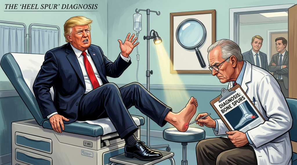
Which leads, inevitably, to Donald Trump. As confirmed by Selective Service records obtained and reported by multiple news outlets, Trump received five Vietnam-era draft deferments — four for college attendance at Fordham and the Wharton School, and a fifth in 1968, recorded as a medical deferment for bone spurs in his heels. The medical classification left him disqualified for military service.
The circumstances surrounding the diagnosis have been contested ever since. Reporting by the New York Times included accounts from the daughters of a Queens podiatrist named Larry Braunstein, who alleged that their father had provided or vouched for the diagnosis as a professional favor to Trump’s father, Fred Trump — a landlord to whom Braunstein reportedly owed a debt of gratitude. Trump’s former lawyer Michael Cohen also testified that Trump had admitted to fabricating the injury. Trump himself has maintained that the diagnosis was legitimate, stating that a doctor “gave me a letter — a very strong letter — on the heels.” The underlying medical records that would resolve the dispute are, conveniently, not publicly available; most individual Selective Service medical records from that era were subsequently destroyed.
It’s worth noting that Trump’s pattern — using legal channels, including a medical deferment of questionable validity, to avoid Vietnam service — was not unique to him. Historians have pointed out that numerous prominent figures on both sides of the political aisle received deferments of various kinds, including Joe Biden (asthma), Dick Cheney (student deferments), Bill Clinton (navigated the ROTC system), and George W. Bush (National Guard). The heel spur episode became politically charged in part because of Trump’s later hawkish rhetoric and his outspokenness in questioning the military service of others — most notably Senator John McCain, who spent years as a prisoner of war in North Vietnam.
How Many People Got Heel Spur Deferments?
This is where the historical record hits a hard wall. No reliable statistics exist specifically for heel spur deferments. The Selective Service tracked broad categories — student deferments, hardship deferments, conscientious objector status, medical disqualifications — but it did not publish a breakdown by specific diagnosis, and most individual medical records from that era no longer exist.
What we can say is that bone spurs were a recognized medical disqualifier under Selective Service regulations, that medical deferments broadly were a commonly used — and commonly abused — avenue for avoiding service, and that the process was heavily influenced by access to sympathetic physicians. A man with means, connections, and a cooperative podiatrist had options that a man without those resources did not.
The honest answer, then, is that we don’t know how many men received deferments citing heel spurs specifically, and we almost certainly never will. The data either wasn’t tracked at that level of granularity or was long since destroyed. What we do know is that the condition became, for a time, a lens through which Americans examined something much larger: who serves, who doesn’t, and whether the systems meant to govern those decisions are applied fairly.
For most people, a heel spur is a manageable, if annoying, footnote in the story of their health. For at least one person, it became a footnote in the history of American politics.
Personal Note: I have heel spurs; I wish I’d known about them in 1967.
Images generated by author using AI.
Medical Sources
Cleveland Clinic — Heel Spurs overview
https://my.clevelandclinic.org/health/diseases/21965-heel-spurs
WebMD — Heel Spur Causes, Symptoms, Treatments, and Surgery
https://www.webmd.com/pain-management/heel-spurs-pain-causes-symptoms-treatments
Hackensack Meridian Health — Bone Spurs in the Heel: Symptoms and Recovery
https://www.hackensackmeridianhealth.org/en/healthier-you/2024/01/02/bone-spurs-in-the-heel-symptoms-and-recovery
OrthoArkansas — Heel Spurs
https://www.orthoarkansas.com/heel-spurs-orthoarkansas/
EmergeOrtho — Heel Bone Spurs: Causes, Symptoms, Treatment
https://emergeortho.com/news/heel-bone-spurs/
American Academy of Orthopaedic Surgeons — Plantar Fasciitis and Bone Spurs
https://orthoinfo.aaos.org/en/diseases–conditions/plantar-fasciitis-and-bone-spurs/
Vietnam Draft & Military Service Sources
History.com — 7 Ways Americans Avoided the Draft During the Vietnam War
https://www.history.com/articles/vietnam-war-draft-avoiding
Wikipedia — Draft Evasion in the Vietnam War
https://en.wikipedia.org/wiki/Draft_evasion_in_the_Vietnam_War
Wikipedia — Conscription in the United States
https://en.wikipedia.org/wiki/Conscription_in_the_United_States
Students of History — The Draft and the Vietnam War
https://www.studentsofhistory.com/vietnam-war-draft
University of Michigan — The Military Draft During the Vietnam War
https://michiganintheworld.history.lsa.umich.edu/antivietnamwar/exhibits/show/exhibit/draft_protests/the-military-draft-during-the-
Vietnam Veterans of America Chapter 310 — Vietnam War Statistics
https://www.vva310.org/vietnam-war-statistics
Vietnam Veterans of Foreign Wars — Fact vs. Fiction: The Vietnam Veteran
https://www.vvof.org/factsvnv.htm
New York City Vietnam Veterans Plaza — Interesting Facts About Vietnam
https://www.vietnamveteransplaza.com/interesting-facts-about-vietnam/
Medical Disclaimer
The information provided in this article is intended for general educational and informational purposes only and does not constitute medical advice. It should not be used as a substitute for professional medical advice, diagnosis, or treatment.
Always seek the guidance of a qualified healthcare provider with any questions you may have regarding a medical condition or treatment. Never disregard professional medical advice or delay seeking it because of something you have read here.
If you are experiencing a medical emergency, call 911 or your local emergency number immediately.
The author of this article is a licensed physician, but the views expressed here are solely those of the author and do not represent the official position of any hospital, health system, or medical organization with which the author may be affiliated.


The One True Gospel of Wellness
By John Turley
On April 23, 2026
In Commentary, Medicine
Why Every Guru Thinks They’ve Found the Only Path to Health
There’s a peculiar affliction that seems to strike fitness influencers, biohackers, homeopathic healers, and wellness gurus with near-universal consistency — the unshakeable conviction that they, and only they, have cracked the code on human health. Whether it’s cold plunges at 4 a.m., microdosing mushrooms, coffee enemas, or whatever supplement stack is trending this week, every one of these prophets arrives at the same conclusion: their method is the path, the others are at best misguided, and mainstream medicine is a corrupt temple worth burning down.
Psychologists have a name for part of what’s happening here. It’s called the Dunning-Kruger effect — the tendency for people with limited knowledge in a domain to overestimate their own competence. But that’s only part of the story. Many of these figures are genuinely smart, sometimes even credentialed. What really drives the zealotry is something closer to what researchers call “belief perseverance” — the tendency to hold tightly to a conclusion even when contradicting evidence rolls in. Once someone has built an identity, a brand, and an income stream around a single idea, the psychological and financial cost of admitting nuance becomes enormous.
Take the biohacking community as a prime example. Some influencers — like the self-proclaimed “father of biohacking” — have built empires on the premise that optimizing the body is a matter of finding the right levers and pulling them correctly. They have championed everything from Bulletproof Coffee to infrared saunas to testosterone replacement, positioning each as a revelation that conventional medicine is too slow or too corrupted to acknowledge. The problem isn’t that all of these interventions lack merit — some have legitimate science behind them. The problem is the rhetorical framework: the idea that skeptics aren’t just wrong, they’re complicit. That’s not science; that’s a revival meeting.
Homeopathy sits at a different extreme but runs on the same engine. Developed in the late 18th century by Samuel Hahnemann, homeopathy is based on the idea that substances that cause symptoms in healthy people can cure those symptoms in the sick — and that extreme dilution actually strengthens a remedy’s potency. The scientific consensus is unambiguous: systematic reviews and meta-analyses have repeatedly found homeopathic remedies perform no better than placebo. And yet its advocates don’t merely disagree with this consensus — they dismiss the entire evidentiary framework, arguing that conventional research methods simply can’t measure what homeopathy does. It’s an airtight position: no evidence can ever count against it.
The fitness world runs its own version of this dogmatism on a perpetual loop. CrossFit devotees insist that anything other than functional high-intensity training is a waste of time. Carnivore diet advocates declare that vegetables are quietly poisoning you with antinutrients. Yoga instructors sometimes slide into the claim that breath control and mindfulness can substitute for actual medical care. Each subculture has its orthodoxy, its apostles, and its convenient explanations for why people who don’t follow the program are sick, lazy, or deceived. The irony is that many of these systems contain genuinely useful elements. Resistance training really does build muscle and bone density. Mindfulness really does reduce cortisol. Dietary quality really does matter enormously. But the insistence on one method to the exclusion of all others transforms useful practices into something closer to religious doctrine.
What’s lost in all the noise is the most important truth in medicine: human bodies are wildly heterogeneous. What works beautifully for one person may be ineffective or even harmful for another. This isn’t a flaw in the science — it is the science. Precision medicine, one of the most promising frontiers in modern healthcare, is built entirely on this recognition. The dream of a single universal protocol for human health isn’t just unrealized — it’s probably unrealizable. Yet that’s precisely what every wellness guru is selling.
There’s also a social dimension worth naming. The wellness industry is, in the most literal sense, an industry. It generated an estimated $5.6 trillion globally in 2022, according to the Global Wellness Institute, and that number continues to climb. When someone’s livelihood depends on their particular system being not just good but uniquely correct, objectivity becomes a luxury they can’t easily afford. Dismissing alternatives isn’t just tribalism — it’s good business.
None of this is to say that skepticism toward mainstream medicine is always misplaced. Conventional healthcare has real blind spots — in chronic disease management, in nutrition research, in the treatment of pain, and in its historical tendency to dismiss patient experience. The gurus often fill genuine gaps that the system has left open. But filling a gap is different from claiming you have the only map to the entire territory. The honest answer in health and fitness, as in most complex domains, is that we know a good deal, we don’t know quite enough, and anyone who tells you they’ve figured it all out probably hasn’t.
The next time someone tells you they’ve discovered the only way — whether it’s a supplement protocol, a spiritual practice, or a morning routine — it might be worth asking the simplest question in science: compared to what? If the answer is a dismissive wave at everything else, you probably have your answer.
Illustration generated by author using ChatGPT.
Sources
Global Wellness Institute — Global Wellness Economy Monitor: https://globalwellnessinstitute.org/industry-research/
Ernst E. — Homeopathy: The Undiluted Facts (Springer, 2016): https://link.springer.com/book/10.1007/978-3-319-43592-3
Dunning D. — The Dunning-Kruger Effect, Advances in Experimental Social Psychology: https://www.sciencedirect.com/science/article/pii/S0065260111440024
National Institutes of Health — Precision Medicine Initiative: https://www.nih.gov/research-training/allofus-research-program
Medical Disclaimer
The information provided in this article is intended for general educational and informational purposes only and does not constitute medical advice. It should not be used as a substitute for professional medical advice, diagnosis, or treatment.
Always seek the guidance of a qualified healthcare provider with any questions you may have regarding a medical condition or treatment. Never disregard professional medical advice or delay seeking it because of something you have read here.
If you are experiencing a medical emergency, call 911 or your local emergency number immediately.
The author of this article is a licensed physician, but the views expressed here are solely those of the author and do not represent the official position of any hospital, health system, or medical organization with which the author may be affiliated.